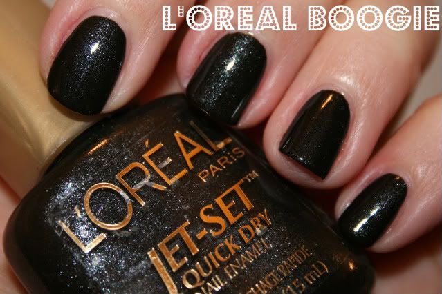
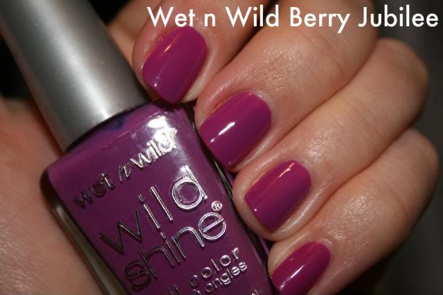
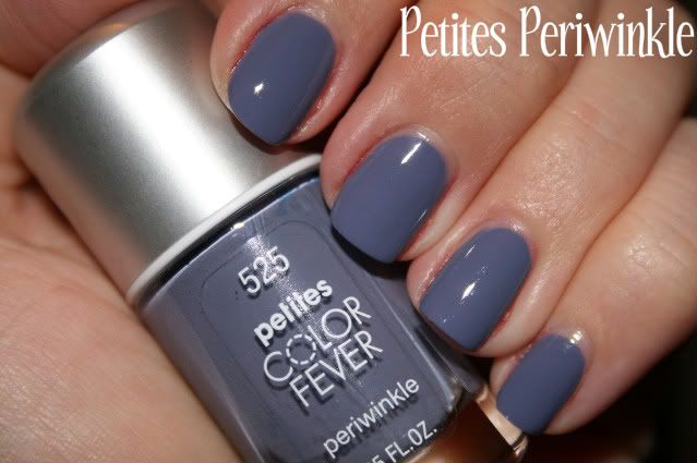
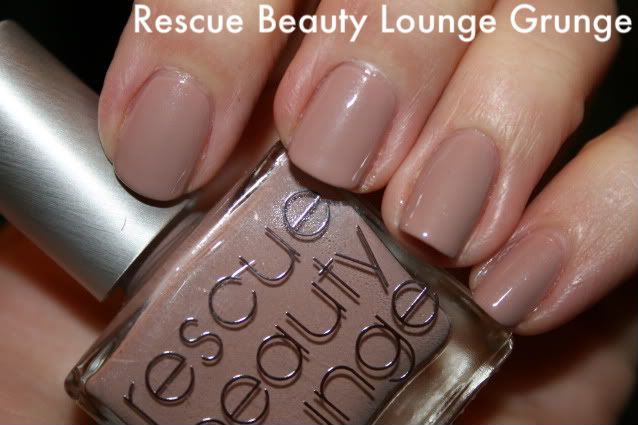
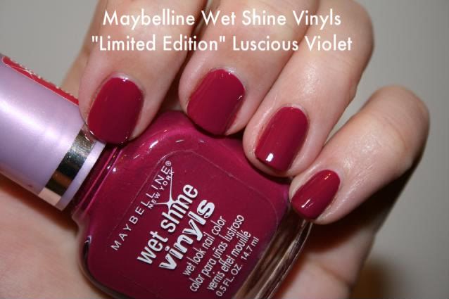
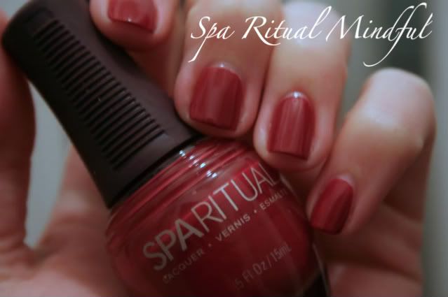
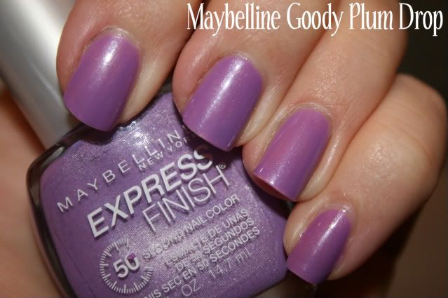
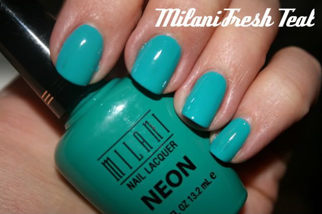
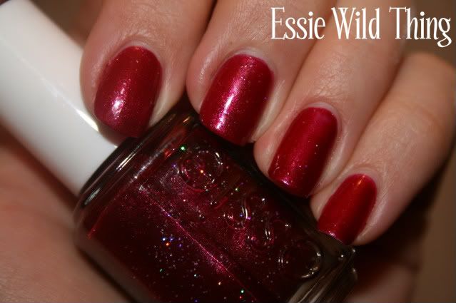
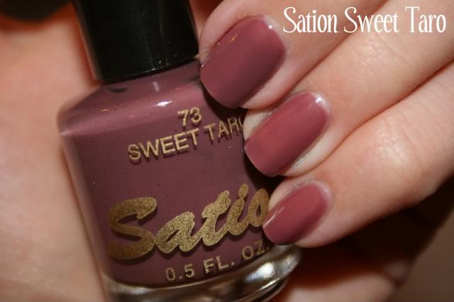
Here are some colors I've worn lately; enjoy!
5/19/10
5/13/10
So what says "neutral" to you?
You'll recall that a while back I started a new job and posted about sticking to neutrals and other non-attention-getting shades until I got the lay of the land.
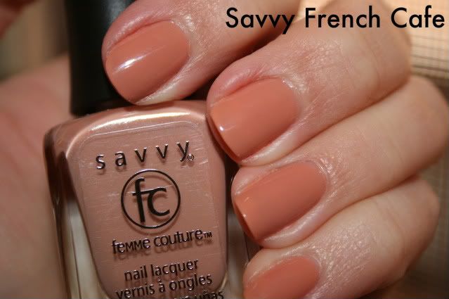
I wore Rescue Beauty Lounge Grunge for one of my interviews and for my first couple days on the job and I really liked it. This picture is from back then, but it reminds me of something I wore more recently, Savvy French Cafe.
I loved this, too. It really does remind me of a cup of coffee with extra extra cream (the way I like it) and possibly a bit of caramel syrup? I actually got some comments on this because I had been wearing so much blue! Teal! Hot yellow! lately that paradoxically, everyone noticed the neutral. Go figure.
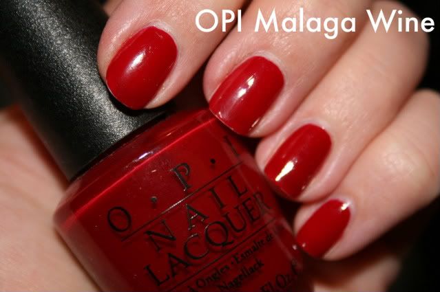
It didn't take long for me to figure out that pretty much anything goes (nail color wise) at my workplace, which has been great in terms of making my way through my collection and trying stuff pretty much whenever I want. Sometimes though there's an occasion where day-glo orange or green jelly isn't really entirely right. For instance a few weekends ago I attended a bridal shower at an art museum and I liked the sound of dark red nails with my black and camel dress.
Malaga Wine has long been a favorite of mine, and I was happy to pull it out after a long hiatus. To me, a chic red nail is its own kind of neutral. I went through a long stretch of wearing either Malaga Wine or OPI's Mrs. O'Leary's BBQ exclusively, and while I'm more a fan of variety these days, I still have a special place in my heart for these colors.
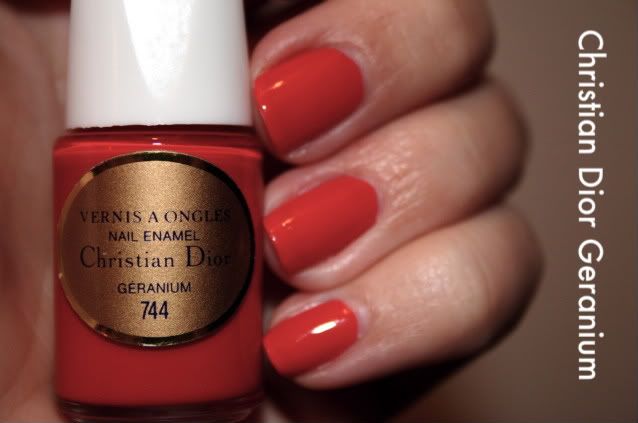
Bright tomato reds can also fall into the category of alternative neutrals. This is one that I can see Joan Holloway on Mad Men wearing.
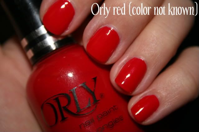
I put this on recently after chopping my nails down in anticipation of my upcoming move. Shortly after doing this I potato-peelered one of my nails to such an extent that even Orly Nail Rescue, which I normally love, was no help. Boo hoo.
In my opinion a good red "neutral" is free of shimmer or glitter, but that's just me. Berry shades can also fit this neutral bill and some people may find them a bit fresher or just a better match with their skin tone.
Enjoy!
5/12/10
Get the Chanel outta here!
I won't!
Because I have a deeply ingrained habit of aspirational buying, I have long gazed wistfully at the Chanel nail polish collections being displayed on the MUA nail board. To me, there is really no difference at all between a $1.29 Wet n' Wild red nail polish and a $23 (!!!!) Chanel red nail polish (which is why I don't have any of the latter), but when Chanel makes unique colors I get all weak in the knees and stamp my foot in frustration because I know that paying $23 for nail polish is a silly, spoiled, ridiculous thing to do.
So, I resisted. I resisted the Jade craze and bought the $4 Claire's Boutique dupe instead. I resisted the lovely Particuliere, because I already have any number of similar colors and more inexpensive dupes are readily available. But then Chanel outsmarted me by introducing Nouvelle Vague and the Orient Extreme limited edition collection.
I caved.
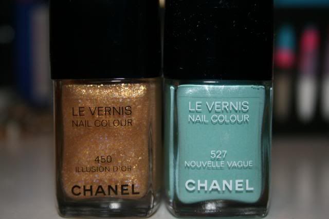
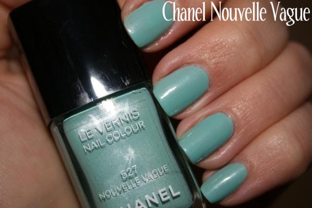
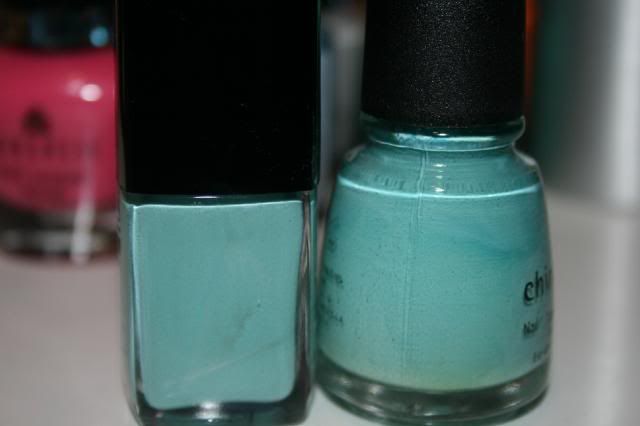
Illusion D'Or and Nouvelle Vague ("new wave" in French). I haven't tried Illusion D'Or over anything particularly nice yet (I just threw it on a couple nails to get a sneak peek), but I am in super love with Nouvelle Vague:
Damn you on the reals, Chanel. It's very hard to resist you when you keep making these wonderfully unique colors! Of course, some of this is in the eye of the beholder. Many women on the MUA nail board passed on Nouvelle Vague, being content with China Glaze's For Audrey. Here's a quick glance at that comparison:
For me, they're not the same. They look remarkably similar in the picture, but Nouvelle Vague has that lovely subtle shimmer, and For Audrey has a chalky quality to it that changes the look of the color on the nail. This is not to say I'm not fond of For Audrey; it's one of the first colors I bought when I started looking at swatches on the nail board and on nail blogs. The chalkiness - for lack of a better word - gives For Audrey a stand-out look that always garners a lot of compliments. It's quite unique. And if you're just looking for a light blue nail color that's attention-getting and unusual, For Audrey may fit the bill.
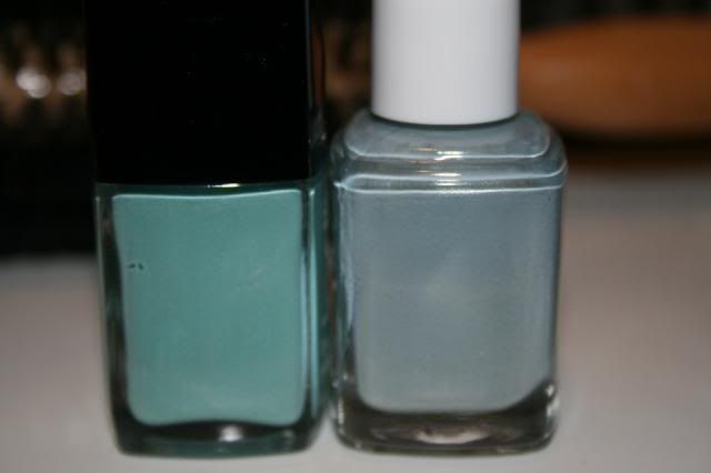
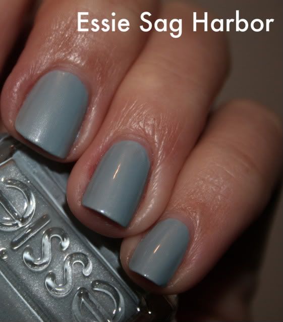
If however you're looking for the sophistication and dreamy quality Nouvelle Vague affords, you have another option. For me, Essie's Sag Harbor comes pretty close, although the colors are quite different. Both Nouvelle Vague and Sag Harbor are light blues with shimmer, but see for yourself how they differ:
While the tones are different, the same muted and dreamy quality is there. Given the variety of skin tones out there, Sag Harbor may even suit you better. So if you have or can purchase either of these cheaper polishes, perhaps you would be content without Nouvelle Vague. (I mean...it's nail polish so hopefully you are "content" without any of them...but...you know what I'm saying.)
5/11/10
Roy G Biv
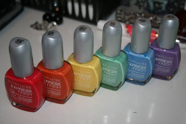
So for today's post I thought we'd take a closer look at this very diverse family:
Aren't they pretty?
I've tried them all except the first one in that pic, the red (which is really a coral). But here are the rest of them.
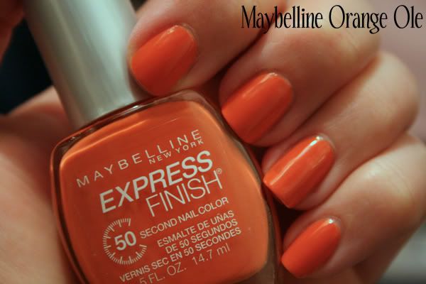
Loved this one. I like the idea of orange nail polish but I don't often love the results on me. This one was different - a bit muted, a bit burnt. I would almost say work appropriate in most offices. Still has the fun and pop of orange, but with a bit of sophistication.
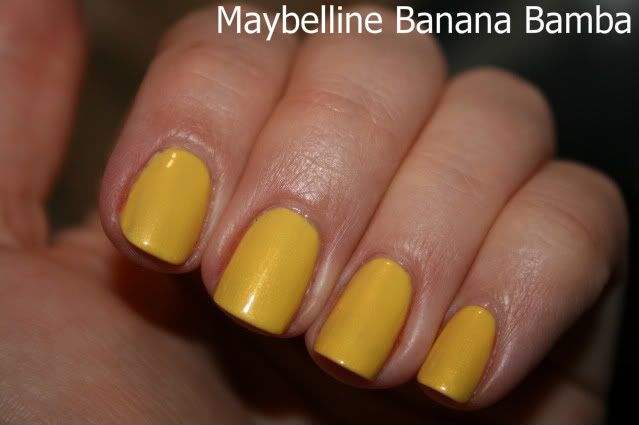
Initially I was disappointed this had a slight shimmer, but it's really quite pretty. The formula sort of sucks, which seems to be the way with yellows. I will wear this one again.
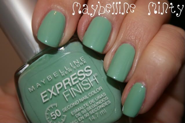
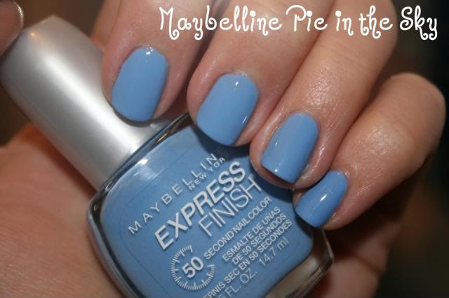
Maybelline Minty kicked off this whole Maybelline-acquiring spree. People on the MUA nail board went bonkers for it and, like a good lemming, I promptly fell in line. Minty, Pie in the Sky and Goody Plum Drop are all from the same collection and they all had similar issues with formula. I'm not exactly sure what the problem is, but the first coat goes on and looks almost gritty. Some people have speculated this is because the bottles don't contain the usual metal mixing balls. Maybe that's it? I'm not sure, but at least with my bottles the issues straightened themselves out on the second and third coats. I ended up loving all of these, particularly the green and the blue.
Again, grittiness on the first coat, perfection thereafter.
Pretty, though I would say my least favorite of the grouping. This is another instance where I thought I was buying a creme, then got it home and discovered it was a shimmer. Also I could probably do with an additional coat here.
So there's your Maybelline rainbow! Enjoy.
5/9/10
Return of the mack
I undeleted my blog. Turn here for swatches and insightful commentary.
Since I last posted in February, about 8,000 new nail polish colors have been released. But you know all that already so here are some colors I've worn since we last spoke, along with comments where appropriate. I won't post every mani I've done since February all at once but it's still a lot of colors so let's get started shall we?
This was pretty and very fun to wear. You'll notice the color on the nail doesn't match the bottle and that's because the bottle is opaque. This bugs a lot of people in terms of being able to see the color accurately, but I kind of like the bottle. Lots of ladies bag on the Milani bottle because they look dated, but again it doesn't bother me very much.
Wasn't "wild" about this one, haha. The glitter is too sparse for me, and frankly the polish would be prettier without it.
I did a terrible job on this mani but I do like the color. I'd like to give it another chance. I think perhaps I'd use a sheer nude polish as my base coat.
That's all for now! I have a couple of ideas for theme posts that will catch us up, so stay tuned!
Yay for nail polish!
Subscribe to:
Posts (Atom)
